


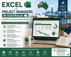
If you’ve been searching for a clear, practical professional excel dashboard tutorial that actually works you’ve found it. Whether you work in finance in Melbourne, administration in Sydney, HR in Brisbane, or sales in Perth, this guide will walk you through building a fully interactive, professional-looking Excel dashboard from scratch. And the best part You can do it in under 30 minutes, even if you’ve never built a dashboard before.
Dashboards are no longer just for data analysts and IT teams. Today, Australian employers in every industry expect their staff to present data clearly, make informed decisions quickly, and report results without relying on expensive software. Microsoft Excel is already on most workplace computers and this excel dashboard tutorial will help you unlock its full power.
In this guide, you’ll learn the exact steps to go from a raw spreadsheet to a polished, interactive dashboard your manager will actually want to read. No complicated formulas, no programming skills required just practical, step-by-step Excel skills you can use from day one.
Who Is This Practical Excel Dashboard Tutorial For?
This excel dashboard tutorial has been designed for:
- Beginners learning Excel no prior dashboard experience needed
- Office professionals in admin, finance, HR, operations, or sales roles across Australia
- Students and job seekers who want to add Excel dashboard skills to their resume
- Small business owners who need to track KPIs without expensive reporting tools
- Anyone who spends too long formatting reports every week and wants a faster, smarter way
If you can open Excel and click a mouse, you can follow this tutorial. Our students from our online Excel course Australia consistently tell us this is the skill that changes how they work every single day.
What You’ll Learn in This Excel Dashboard Tutorial
- How to prepare and clean your data so your dashboard always works correctly
- How to build PivotTables that summarise thousands of rows in seconds
- How to create charts that turn numbers into clear, visual stories
- How to add Slicers to make your dashboard fully interactive with one click
- How to design your dashboard so it looks polished and professional
- Real-world examples used by Australian professionals in Melbourne, Sydney, Brisbane, and beyond
By the end of this excel dashboard tutorial, you’ll have a working dashboard you built yourself and the confidence to build more.
Excel Dashboard Tutorial: Step-by-Step Guide (30 Minutes)

Follow these five steps in order. Each one builds on the last, and together they take you from raw data to a finished, interactive dashboard.
Step 1: Prepare Your Data (5 Minutes)
Every successful excel dashboard tutorial starts here because good dashboards are built on clean data. Before you touch a chart or PivotTable, spend five minutes making sure your data is structured correctly. Think of it like setting up a solid foundation before building a house.
Open your spreadsheet and check the following:
- Every column has a clear, descriptive header for example: Date, Region, Product, Sales Amount, Rep Name
- There are no blank rows or columns in the middle of your data
- Numbers are stored as numbers, not text (you’ll see a small green triangle if Excel detects a number stored as text)
- Dates are in a consistent format all DD/MM/YYYY or all MM/YYYY, not a mix
Once your data is clean, select the entire range and press Ctrl+T to format it as an Excel Table. Give it a name like SalesData in the Table Design tab. This is a crucial step because Excel Tables automatically expand when you add new rows which means your dashboard will always stay up to date without any extra work from you.
Step 2: Build Your PivotTable (7 Minutes)
PivotTables are the engine that powers almost every great Excel dashboard. They let you instantly summarise and slice your data in any way you need without writing a single formula. Once you’re comfortable with PivotTables, you’ll wonder how you ever reported data without them.
Here’s how to create your first PivotTable as part of this excel dashboard tutorial:
- Click anywhere inside your formatted table
- Go to Insert → PivotTable → From Table/Range
- Select New Worksheet and click OK
- In the PivotTable Fields panel, drag your fields into position: Rows (e.g. Region or Month), Values (e.g. Revenue or Units Sold)
- Right-click the Values area and choose Summarise Values By → Sum
You’ll instantly see a clean summary table of your data. Rename the sheet “Dashboard Data” to keep things organised. You can create multiple PivotTables from the same source — one for revenue, one for volume, one for team performance.
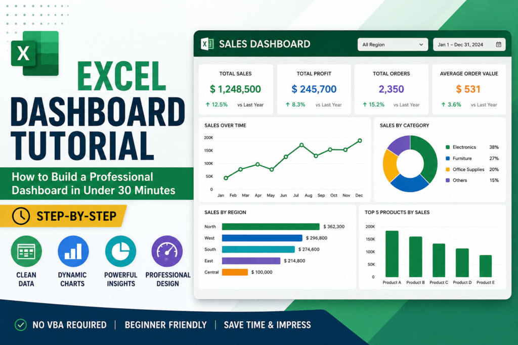
Step 3: Create Your Charts (8 Minutes)
This is where your excel dashboard tutorial starts to look impressive. Charts turn your PivotTable data into visuals that people can understand instantly, even without looking at the numbers.
- Click inside your PivotTable and go to Insert → PivotChart
- Choose a Bar Chart or Column Chart for most business comparisons they’re the clearest and most universally understood
- For trends over time, use a Line Chart
- For proportions or share, use a Pie or Doughnut Chart (sparingly)
- Give every chart a specific, descriptive title: instead of “Chart 1”, use “Monthly Revenue by Australian Region”
- Remove unnecessary elements like busy gridlines, excessive data labels, or a legend when there’s only one data series
Keep your chart styles consistent. Pick one colour palette and apply it everywhere. This small detail makes a huge difference in how professional your dashboard looks it signals that someone thoughtful built it, not just someone who clicked a few buttons.
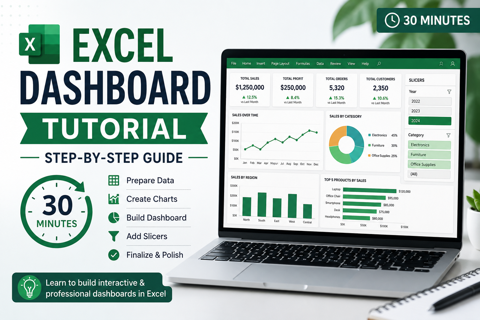
Step 4: Add Slicers for Interactivity (5 Minutes)
Slicers are visual filter buttons that make your excel dashboard tutorial output genuinely interactive. Instead of using filter dropdowns or manually adjusting PivotTable settings, your audience can click a button and instantly see filtered results. This is what separates a basic spreadsheet from a proper dashboard.
- Click your PivotTable or PivotChart
- Go to PivotTable Analyse → Insert Slicer
- Tick the fields you want to filter by Region, Month, Product Category, Team are popular choices
- Click OK, then position and resize your slicers neatly on the dashboard sheet
- To connect one slicer to multiple charts: right-click the slicer → Report Connections → tick all relevant PivotTables
Now when someone clicks “Melbourne” on the Region slicer, every chart on the dashboard filters automatically. That’s real interactivity no coding, no VBA, no complexity.
Step 5: Design Your Dashboard Professionally (5 Minutes)
You’ve done the hard work now make it look the part. A professionally designed excel dashboard tutorial output should look clean, intentional, and easy to navigate. Here’s how to get there quickly:
- Go to View and uncheck Gridlines for a cleaner background
- Set a light grey (#F5F5F5) or white background for the dashboard sheet using Fill Color
- Add a title row at the top merge cells A1:H1 and type your dashboard title in a larger, bold font
- Use Page Layout → Align to align and distribute your charts and slicers neatly
- Apply a consistent colour theme to all charts matching your organisation’s branding if possible
- Hide the sheet tabs, formula bar, and row/column headers for a cleaner, more finished look when presenting
When done, your dashboard should look like it was designed by a professional because it was. You built it from scratch using nothing but Excel.
Pro Tips to Get More From Your Excel Dashboard Tutorial
Our Excel trainers at Excel Courses Online have seen thousands of dashboards built by Australian students. Here’s what the best ones consistently do:
- Use Ctrl+T immediately. Formatting data as a table from the start saves hours of maintenance later and ensures your PivotTables always pick up new rows automatically.
- Name your PivotTables. In the PivotTable Analyse tab, give each one a descriptive name like “Revenue_By_Region”. This makes it much easier to manage when you have multiple tables on a dashboard.
- Set up auto-refresh. Right-click your PivotTable → PivotTable Options → tick “Refresh data when opening the file”. Your dashboard will always show current data the moment someone opens it.
- Keep it focused. The best dashboards answer one clear question. Ask yourself: “what decision does this help someone make?” If you can’t answer that, simplify.
- Use keyboard shortcuts. Alt+N+V inserts a PivotTable. Alt+N+C inserts a chart. F5 opens Go To for fast navigation. Speed matters when deadlines are tight.
For a deeper dive into all these techniques, our Excel training for beginners course covers everything in this excel dashboard tutorial plus dozens of advanced techniques used by Australian professionals every day.
Real-World Excel Dashboard Tutorial Examples Used Across Australia
Still wondering how this applies to your specific job, Here are three dashboard types that Australian professionals build using exactly the skills in this excel dashboard tutorial:
Sales Performance Dashboard Used by Sales Teams in Melbourne & Sydney
Track monthly revenue, deals closed, pipeline value, and performance by rep or region. A slicer for State or Territory lets managers filter the entire dashboard with one click. Sales directors across Australia use this to run weekly team reviews without ever opening a separate reporting tool.
HR Workforce Reporting Dashboard Used by HR Teams in Brisbane & Perth
Monitor headcount by department, staff turnover rates, leave balances, and recruitment pipeline progress. HR professionals in Queensland and Western Australia use this dashboard to present workforce data to the executive team in a format that’s clear, visual, and instantly understandable.
Finance & Budget Tracking Dashboard Used by Finance Teams Across Australia
Compare actual spend versus budget by department, track monthly variances, and flag overspend automatically using conditional formatting. Finance officers, bookkeepers, and accountants across Australia save hours every month by replacing manual reports with this kind of live, interactive dashboard.
Common Excel Dashboard Tutorial Mistakes to Avoid
Even experienced Excel users fall into these traps. Learning about them now will save you from redoing your work later:
- Skipping the Table format step. Connecting PivotTables to raw data ranges instead of a formatted table means your dashboard won’t update when you add new data rows.
- Too many charts on one screen. If your audience has to scroll or squint, you’ve lost them. Three to five focused charts tell a clearer story than ten cluttered ones.
- Inconsistent formatting. Mixing fonts, colours, and chart styles makes a dashboard look rushed. Choose one style and apply it consistently across every element.
- Not connecting slicers to all charts. If you have three charts but only one responds to the Region slicer, users will get confused. Always use Report Connections to link all related PivotTables.
- Forgetting chart titles. “Chart 1” tells your audience nothing. “Q2 Revenue by Australian State” tells them everything they need to know at a glance.
Avoiding these mistakes is exactly the kind of practical knowledge covered in our best Excel course online Australia programs.
Frequently Asked Questions About This Excel Dashboard Tutorial
How long does it take to build an Excel dashboard?
With the steps in this excel dashboard tutorial, most beginners can build a working dashboard in 30 to 45 minutes on their first try. As you practise, you’ll get faster experienced users can build a complete dashboard in under 15 minutes.
Do I need advanced Excel skills to follow this tutorial?
No. This excel dashboard tutorial is designed for complete beginners. If you can navigate Excel and click a mouse, you can follow every step. We’ve taught these skills to students across Australia who had never used PivotTables before.
Which version of Excel does this tutorial work with?
This excel dashboard tutorial works with Excel 2016, 2019, 2021, and Microsoft 365 (the subscription version). Most steps also work in Excel for Mac, though some menu names differ slightly. If you’re using Microsoft 365, you’ll have access to a few extra features not covered here.
Can I use this for my job straight away?
Absolutely. Every technique in this excel dashboard tutorial is taken directly from real workplace dashboards used by Australian professionals. You can adapt the steps to your own data and have a working dashboard ready to share with your team today.
Explore More Excel Resources From Excel Courses Online
This excel dashboard tutorial is just the beginning. Once you’ve built your first dashboard, here’s where to go next:
- Excel for Beginners — Online Course (Australia) — Start here if you’re new to Excel
- Advanced Excel Formulas Guide — Take your skills to the next level
- Excel PivotTable Tutorial for Beginners — Deep dive into PivotTables
- Excel Shortcuts: 50 Essential Shortcuts for Australian Professionals — Work faster every day
We also recommend checking the Microsoft Excel official support documentation for up-to-date feature references, and Chandoo.org, a globally trusted Excel learning resource, for additional dashboard inspiration.